Pop-up or Slide-in Bar? We Found Out What Really Works for Collecting Contacts
Online stores often handle email sign-ups with a simple but fairly aggressive pop-up on the landing page. You offer visitors a discount, show a form and wait for your database to grow. But what if there’s a more discreet approach that can be up to twice as effective? Read our new case study.
In this article
Online stores often handle email sign-ups with a simple but fairly aggressive pop-up on the landing page. After a few seconds you show a form, offer the visitor a discount and wait for your database to grow.
But what if there’s an approach that’s more discreet, yet can be up to twice as effective?
Because at 4Bros we don’t settle for the usual playbook, we decided to test, for our client Betula.cz, a premium maker of goat colostrum supplements, how best to motivate visitors to sign up for the newsletter in exchange for a 10% discount.
In this case study, we’ll show you why it doesn’t pay to look only at absolute numbers and how in-depth data analysis can change your marketing strategy.
Hypothesis: does a premium product need hard pressure?
When designing the strategy, we started from buying behavior. Betula’s products aren’t a cheap impulse buy – customers often want to read up on them first, find out what colostrum actually is, how it works and where it comes from, weigh up its benefits and build trust in the brand.
Our question was: Won’t an aggressive pop-up with a 10% discount that jumps out at customers the moment they arrive be more of a nuisance? Shouldn’t we give people room to get to know the product first?
The A/B test setup
So we ran a test:
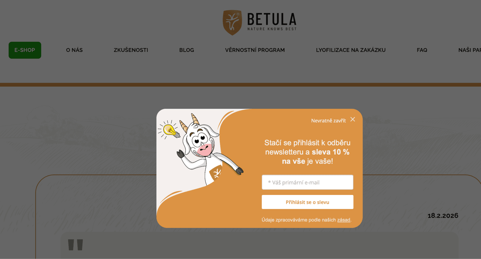

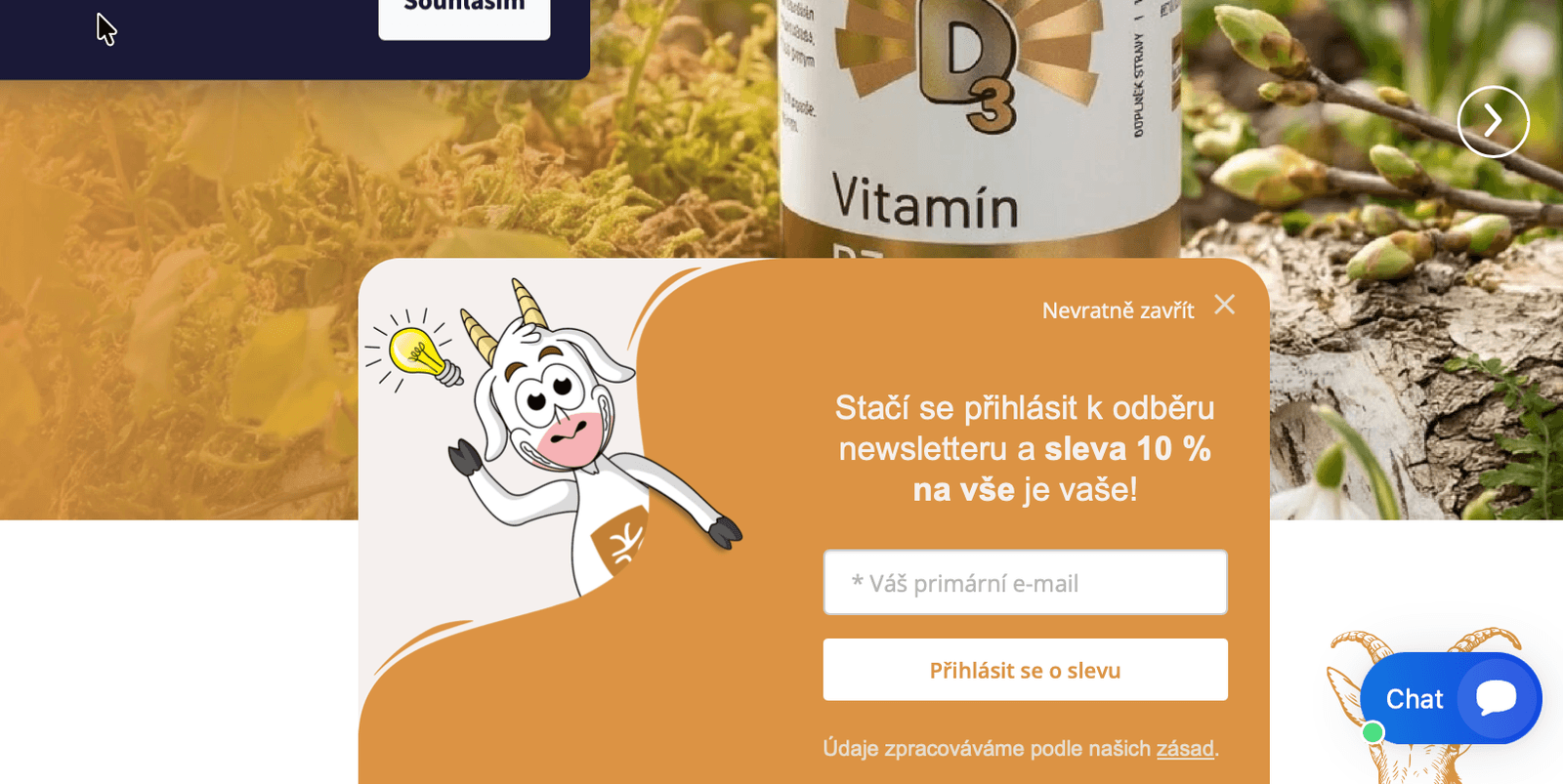
- Variant A (classic pop-up): A window covering the entire page content, appearing once the visitor reaches their 3rd page on the site. Aggressive and impossible to miss.
- Variant B (subtle slide-in bar): A slide-out bar in the bottom right corner. Always visible, but it doesn’t block content and lets users keep reading and browsing. The risk, though, is that people may not notice it before leaving the site.
- In both variants, we kept the FOMO element (fear of missing out) – once a user closes the form, the discount never shows up again.
The “absolute numbers” trap, or how the pop-up won at first glance
When the test ended, the winner seemed clear at first glance.
- The pop-up brought in almost 40% more contacts than the bar.
But when we looked at the results more closely, we found the opposite was true. During the period when the pop-up was running, the website had significantly higher overall traffic. If we had blindly gone by the number of emails collected, we would have recommended the worse solution to the client. The real magic lies in the conversion rate (CR) in the context of traffic.

Results: the bar as the expected champion
Once we adjusted the data for the effect of traffic, reality confirmed our original conviction.
- 2× higher efficiency: The subtle bar in the bottom right corner achieved more than double the conversion rate of the aggressive pop-up.
- Dominance among new users: We saw an even more striking difference among completely new visitors (according to GA4). Those visiting the site for the first time responded to the less intrusive way of collecting contacts much better. That confirmed our hypothesis that new customers need to get to know this specific product first.
The conclusion for Betula.cz is clear: we’re keeping the green bar at the bottom of the site. It may be less “loud”, but for this type of product and target audience it works many times better.
What can your business take away from this test?
1. Aggressiveness ≠ performance
Pop-ups can annoy users, especially with products that involve a longer decision-making process. If you pull a customer away from reading important information with a pop-up, you risk putting them off.
2. Context is everything
What works in fast fashion or for big established brands may not work for premium supplements from a small local brand. That’s why, when designing a strategy, we don’t just look at the format itself. We also look at the product, the decision-making process, the website content, brand trust and the stage the customer is at.
3. Test, don’t guess
The only way to find a truly optimal solution is continuous testing and correct interpretation of data.
At 4Bros, we think about marketing strategically
This case study is proof that a proactive approach and questioning “the way it’s always been done” bring our clients real value and make their investment work harder. We’re not just executors – we think about their business in context, go deep and look for long-term value.
Want to find out where your marketing is leaking opportunities? Let’s take a look together.